

Join me as I work out how I feel about this epic series! That’s always fun, right?


The Wicked + The Divine by Kieron Gillen (writer), Leigh Alexander (writer, issue #23), Dorian Lynskey (writer, issue #23), Laurie Penny (writer, issue #23), Mary HK Choi (writer, issue #23), Ezekiel Kweku (writer, issue #23), Jamie McKelvie (artist, issues #1-45), Kate Brown (artist, issue #12), Tula Lotay (artist, issue #13), Stephanie Hans (artist, issue #15, 1831 One-Shot), Leila Del Duca (artist, issue #16), Brandon Graham (artist, issue #17), Kevin Wada (artist, issue #23), André Araújo (artist, 455 One-Shot), Kris Anka (artist, Christmas Annual), Emma Vieceli (artist, Christmas Annual), Chynna Clugston Flores (artist, Christmas Annual), Carla Speed McNeil (artist, Christmas Annual), Rachael Stott (artist, Christmas Annual), Aud Koch (artist, 1923 One-Shot), Ryan Kelly (artist, 1373 One-Shot), Jen Bartel (inker, Christmas Annual), Matthew Wilson (colorist, issues #1-45, 455 One-Shot), Tamra Bonvillain (colorist, Christmas Annual), Dee Cunniffe (colorist, issue #14; flatter, issues #15-22, 24-45, 455 One-Shot, Christmas Annual), Mat Lopes (colorist, issue #16), Ludwig Olimba (flatter, Christmas Annual), Brandon Daniels (flatter, Christmas Annual), Fernando Argüello (flatter, Christmas Annual), and Clayton Cowles (letterer).
Published by Image, 50 issues (#1-45, plus 5 specials: 1831 comes after issue #22; 455 comes after issue #28; Christmas Annual and 1923 come after issue #33; 1373 comes after issue #39), cover dated June 2014 – September 2019.
I don’t have any obvious SPOILERS, but you might infer things from what I write, so be aware of that. Also, you can click on the images to enlarge them if you so choose!


In June 2018 our family took a vacation to London, and I met up with Kieron Gillen at a Turkish restaurant near the flat where we were staying (this Turkish restaurant, as a matter of fact). We talked about many things, and Gillen was as charming as ever (my wife and daughter enjoyed meeting him), and I told them that he’s one of the best comic book writers around right now.  But I did tell him that I didn’t love The Wicked + The Divine, his latest book, although I was buying it and I did enjoy it … I just didn’t love it. It still had at least one arc left (I can’t remember exactly what issue was the most recent one at that point, but #37 has a June 2018 cover date, so probably around that one). It was frustrating, because I did like reading it, but something about it didn’t vibe with me. I did tell him that I would re-read the entire thing once it was done and I reached it in the alphabet, which I knew would be soon. So I did, and now I’m writing about it. I must have fallen in love with it in the interim, right?
Well … not completely. These are Comics You Should Own for a variety of reasons, and for the most part, it’s because I love them, but I also hope to be critical about them, not by picking on them, but by looking at how they work. The Wicked + The Divine is a fascinating comic for many reasons, but unlike other Gillen books, I don’t love it. I do, however, think it’s a marvelous achievement, and that’s good enough for me.  It’s Gillen’s longest comic (McKelvie’s, too, but we’ll get to him!), and it’s an achievement, certainly. I’ve always said Gillen isn’t the greatest plotter, which might be a tough thing when you’re trying to pull off a 50-issue masterwork about gods who are also pop stars. Gillen’s plot, as expertly plotted as it is (meaning he never wastes anything, so pay attention!), isn’t really the point. This is basically a Justice League or Avengers or any group superhero book, with gods-as-pop stars instead of superheroes (but, Gillen asks trenchantly, aren’t superheroes gods-as-pop stars anyway, really?) – there’s a group with fairly diverse powers, many of which fall into the category of “shooting energy” in some way, there’s a villain who doesn’t appear to be a villain (Maxwell Lord, let’s say), and there’s a Big Bad, which Gillen hilariously names the Great Darkness because why come up with a fancy name? There’s a great deal of punching and blowing shit up. It’s very entertaining, and, as I noted, very well plotted (every character is important, in other words, no matter how insignificant they may seem at first), but the generic plot is very much a superhero smash-up.
Gillen has another point, though, which is where the pop stars come in. The superhero stuff is window dressing, because the gods returning to Earth and becoming pop stars is the meat of the book. Twelve gods inhabit humans, and they become famous, and two years later, they die.  Ninety years later, the cycle starts again. This seen as a good deal by those who become gods, because they get to do pretty much whatever they want for two years, and they’re all young anyway, so they don’t care about growing old. This is not a surprise in this world, either – there’s academic study on the god cycle in the universe that Gillen creates, and the gods are taken very seriously. This opens them up to fanatics on both sides, from those who worship them whole-heartedly to those who think they’re blasphemers, and Gillen plays on this throughout the series, but especially in the first few issues, when Lucifer is attacked and then put on trial for defending herself with extreme prejudice. This idea of people not being quite comfortable with the gods or wanting to be near them ties in with the idea of celebrity, of course. Laura, our point-of-view character, wants to be a god so badly, but one must be chosen by Ananke, the mysterious woman behind the scenes, and Laura, it seems, will not be. Eventually, she does become a member of the Pantheon, but things don’t work out like she thinks they’re going to. “Star-fucking” is certainly a thing, and Gillen makes Laura and Cassandra, a journalist who is interviewing Lucifer when she’s attacked in issue #1, the opposite sides of the coin, as Cassandra can think of nothing worse than becoming a celebrity, while Laura wants nothing else. It’s a good contrast that’s set up from the very beginning.
This plot of celebrity certainly isn’t new, and when you look at the broad strokes, Gillen doesn’t do too much new with it.  “Art is hard,” the book tells us, which Aaron Bruno of AWOLNATION distilled into two lines at the end of “Jump On My Shoulders”: “It’s not supposed to be easy / that’s why it feels so fucking good,” so why do we need 50 issues to get to that? The lessons the characters learn can be simplistic, certainly, but that doesn’t mean they’re not good lessons to learn, and one thing Gillen does very well (in all his comics, not just this one) is have these characters grow – they learn, they change, they become something different. Again, it doesn’t sound too radical, but it happens less than you might think, even in comics where the creators have total control over the characters’ fates (it happens, obviously, very little in corporate-owned comics, because those corporations have a vested interest in keeping the characters the same). In the early issues of this book, most of the characters are, frankly, assholes. That doesn’t mean they’re not compelling assholes, but they’re still assholes. Lucifer in particular, but Laura isn’t really all that great, either. Early on, only Inanna and Dionysus, who aren’t in the book that much, are nice people, while others have their moments of niceness but counter that with assholery or general cluelessness (Amaterasu falls into this latter category). As the book moves along, though, Gillen shows them trying to change, trying to be better, trying to learn, and while some don’t, the ones who do are better for it. The journey is interesting, and makes the book worth it.
Another odd aspect of the theme “art is hard” is that Gillen chooses to make his gods artists, which is a tricky situation. He specifically, as I noted, makes them pop stars, and while I assume some have real-life analogs (David Bowie and Prince are the two obvious ones, but there might be others that I don’t know because I don’t know pop stars as well as I should), the fact is that comics are a terrible place to make music, as Alan Moore proves whenever he writes songs into his scripts.  In Phonogram, Gillen put music in his comics, but the viewpoint of Phonogram was of the consumer of music, and I would argue that Gillen’s musical name-dropping in the book didn’t matter, because everyone has a musical reference that they could draw upon to get the same idea he was writing about (you can disagree, certainly, but that’s my opinion). With The Wicked + The Divine, he deliberately and consciously flips to the creators’ viewpoint, and things get dicier. Not all of us can get into the head of a creator, and creating art is such a personal thing that it’s more difficult to make it universal. Plus, the major barrier remains: you can’t hear music in comics. Sorry, it’s just not possible. Gillen can’t really explain it, either, so we’re left looking at pop stars perform, but we can’t jump into what Laura, for instance, hears when she’s watching Amaterasu perform. We can try to recall our own experiences at concerts and such, but it’s a little bit of a bridge too far for the reader, and it lessens the impact of Gillen’s writing. McKelvie does his part, turning the performances into dazzling visual experiences, but it’s just too hard. This is thrown into stark relief with the special issues that show us older pantheons, as they are not necessarily made up of pop stars. The first special, set in 1831, features easily identified analogs of Mary Shelley, Percy Shelley, Byron, Samuel Taylor Coleridge, the Brontë sisters, and Edgar Allan Poe (as well as what seems to be an homage to Gaiman’s Dream). Granted, two of those people were dead in 1831 and the Brontës were teenagers, but the point is that they’re analogs, and as we know their writings (or we ought to be familiar with them, at least), Gillen’s allusions make more sense.
  The third (or fourth, if we count the Christmas Annual) special is set in 1923, and while I recognize fewer of the artists (and I am not going to search Reddit to see if anyone has sussed out who they all are, because I’m sure it’s been done), Gillen alludes to Agatha Christie’s And Then There Were None and Virginia Woolf’s To The Lighthouse, to Picasso and Hemingway, and I really want their Woden to be a Max Shreck-as-Count-Orlok analog, but that might be hoping for too much. The point is that when you set things in the past, people are probably going to be familiar with the art and so can relate to the characters a bit more. In the present, we have no idea what a rave with Dionysus or a weird underground concert with the Morrigan sounds like, and it puts us at a remove from the artists that Gillen is asking us to relate to.
At this point, you might be thinking, “So, smart guy, do you like anything about this comic?” Well, of course I do. As I noted, despite the plot being a fairly standard superhero story, it’s a very well done standard superhero story, and that counts for something. And Gillen’s work with the characters is very fascinating. Without anything else but that, this would be a good comic. What elevates is the way Gillen makes the actual creation of the comic part of his larger point, and this brings in McKelvie, Wilson, and Cowles as well. As we read, this becomes a much more metafictional text than we expect, and also one that I’m not positive was intentional. I’ll give Gillen the benefit of the doubt, however, because he’s smarter than I am, and so I assume that while his main point about art is arrived at in a somewhat linear fashion in the text, it’s on display throughout the book in a more metatextual way.  The plotting itself is an example of this. While the “superhero” plot is nothing we haven’t seen before, it really is difficult to plot one as tightly as this. It’s not impossible – several writers have done it – but it’s harder than in, say, a standalone work, because in those you can always go back and retrofit clues into it. Gillen drops clues early and often about things that come up later, and because of the serial nature of the book, he has to have plotted the entire thing out. Despite this being the norm in serial comics these days, it doesn’t always work – Chris Claremont famously dropped clues and then either never followed up on them or followed up on them so strangely that it’s hard to believe that’s what he originally had in mind. But Gillen introduces characters and side notes that become more important as the series moves along, and it’s very clever.
Gillen also drops the “comics” part of the book occasionally and writes straight prose, which is an interesting experiment. In issue #23, he turns the comic into a fashion/entertainment magazine, enlists a bunch of writers, and they give us articles about the characters, with Kevin Wada providing “photograph-like” drawings that you would find in these kinds of magazines. It fits very nicely with the aesthetic that Gillen is going for. He doesn’t write most of that issue, though, but it gives a bunch of interesting writers a chance to flex their muscles. In 1923AD, it’s all Gillen, giving us a meaty mostly prose story that recalls And Then There Were None, in that the gods are being murdered and it seems like an impossible crime. The prose is “interrupted” occasionally by Aud Koch’s moody, sepia-toned drawings, giving us some bursts of visual weirdness among the prose (Dionysus dying in a cubist nightmare is particularly neat). 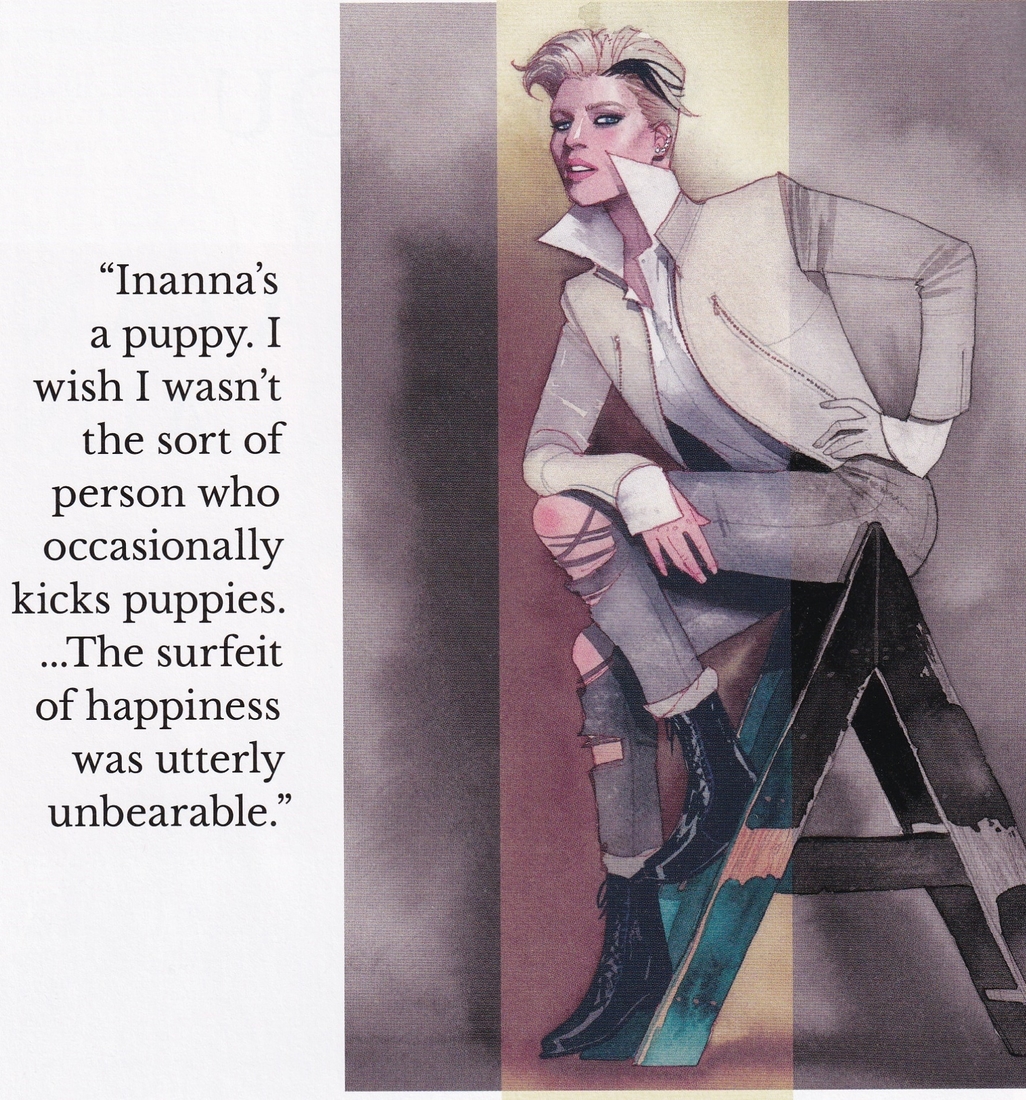 Gillen brings that issue back around to the first issue of the series, which begins in 1923, to show how the survivors got into the room (a few issues later, he reveals even more about the night). In the 1923 special, Gillen has a lot of plot to get to, so he needs to shift to prose. It’s a cool gamble, and it works well.
The prose, however, is just a small section of the overall experimentation that Gillen, McKelvie, Wilson, and even Cowles get up to. The most ostentatious issue in the run is issue #14, which initially seems like just another issue – Woden begins the issue by saying he’s going to explain something, and we settle in. We might recognize the second page (after the title clues us in – “The Re-Re-Remix”), but it’s not until we’re a bit into the issue that we might realize that it’s constructed completely of panels from previous issues (except for, notably, page 1, which throws us off the track!). Gillen and McKelvie have “re-mixed” some earlier issues, in other words, to create a exposition dump that works because of the audacity of the idea. McKelvie did not have a ton to do (he was drawing the third arc of Phonogram at the time, so any work would be a lot, but he had less to do than Gillen and Matthew Wilson), but he still had to put together some things, while Wilson is the true artistic star of the issue. He adds more lurid colors, saturating the pages with sickly yellows and deep, tragic blues and eerie greens and nauseating magentas. As the issue is Woden explaining himself, and Woden is not a pleasant person, Wilson’s colors add a discomfort to Gillen’s words (especially when Woden comes across as more sympathetic than the readers might want, as Woden is still a shit).  Wilson also does some interesting things with backgrounds, adding some patterns to some panels to give them more texture. In a few flashbacks, he dulls the intensity of the colors a bit, which sets them off from the main story. There’s even a sequence in the book that is stolen from Sex Criminals #9, in which Matt Fraction and Chip Zdarksy did a WicDiv porn parody, so Gillen uses those images. Exposition dumps are hard to pull off in any medium, and in comics, the writer has the benefit of having someone drawing them, so Gillen takes full advantage. It’s more than an exposition dump, after all – it’s a look into Woden’s psyche, and as Woden is one of the more important characters, it’s a necessary issue. By the end, Gillen has solved one mystery and opened up another, propelling the story forward. It’s a weird, brilliant issue, and it shows what the creators are doing here.
There are other audacious moments in the series, too, which show how difficult the construction of a comic can be. In an early issue, something shocking happens that lets us know Gillen wasn’t messing around (I really don’t want to spoil it, and it’s not important for what I’m talking about). In issue #36, Gillen and McKelvie show us that this has happened every single time the gods have come back. How do they show us this? After a first page where they introduce the two characters involved, we get 11 (!) pages of six-panel grids showing each time it happens, every ninety years through history, from 3862 BC to the present day. Gillen doesn’t show the exact same thing, though – sometimes one character acts differently, sometimes the other does, sometimes they both do. It might feel excessive, but it shows the progression of the plot and how one character keeps trying to cheat to become immortal. For McKelvie, the pages are astonishing.  Gillen sets them in different places around the world, most in places you’d expect – Egypt, the Middle East, China, Central America, and then Europe later in history – but he also throws in Wrangel Island, which is north of Russia near Alaska (and, according to Gillen, the last place on Earth mammoths were alive, and around the period he places the gods there), and Australia for good measure, and then McKelvie has to dress the characters in the clothes we’d expect for that time period and place. In each panel, he moves them slightly differently, so obviously he can’t just cut and paste. Sometimes one character spins around to the right, sometimes to the left. He has to make sure that the backgrounds fit the places, too, which means researching mountains and deserts and forests and architecture. Wilson colors it beautifully, toning down the colors or brightening them depending on the time of day, making things hazier in a desert or sharper in a forest, and the effect is just marvelous. It also ties into the theme of the book nicely. While Gillen and McKelvie are showing the effort the one character puts into becoming immortal, they themselves are putting in an even bigger effort, and the implication is that this art, which they work at so hard, will make them immortal. The character, despite working for 6000 years, is taking a short cut to immortality. Gillen and McKelvie take no such shortcuts.
An issue later, they do take a shortcut, but by doing so, they become even more audacious. On the first page, we see the final stages of one pantheon – in Egypt in 3127 BC. A character then has to spend the next ninety years in a quasi-dead state, apparently conscious but bodiless. So we get ten (!) pages in a nine-panel grid of total blackness. Yep. Nine panels a page, for ten pages, of nothing (see above, because I didn’t want to spoil issue #36).  It’s an incredible move, almost, and you might be angry about it, but it’s amazingly effective. When the character comes out the other end, she’s insane (perhaps, you could argue, more insane than she already was), and if you really look at the pages instead of flipping past them, you can see why. Of course the optical illusion kicks in, where you see hazy blackness at the intersections of the gutters, which is what always happens when you contrast white and black so starkly. The pages start to gnaw at you, and they become like the Sideshow Bob-stepping-on-rakes bit – funny, then annoying, then surreal in a way that takes you to another level of consciousness, almost. The relentlessness of the pages is what gets to you, and it’s perhaps the best representation in comics, ever, about why characters go crazy. All, mind you, with little to no input from the actual creative team. It’s brilliant.
Where the book really shows its “art-is-difficult” side is in the artwork of McKelvie and Wilson. McKelvie has always been good, but he’s also always improved, until now he’s one of the best artists in the business, and The Wicked + The Divine is his masterpiece. He’s worked with Wilson for most of his career, and they make an amazing team, as Wilson has gotten better over the years as well. Artistically, this series is just a joy to look at, and it’s all the little details that the artists put into it that make it special and also make it a confirmation of Gillen’s thesis. This begins in the very first issue, when Laura goes to see Amaterasu’s concert. McKelvie gives us a double-page spread of the “god” singing and Laura, enraptured, in the audience, but it’s Wilson adding the sparkly effects that make the scene shine.  It’s a little thing, but it gives us a sense of not only place but of moment, as we’re transported to the concert, and Gillen doesn’t even try to keep up, as Laura narrates almost-gibberish because we can’t experience what’s happening rationally, but viscerally. That’s what the art does, not the words. When Laura passes out a few pages later, McKelvie does something simple yet brilliant – he narrows the panels until we get a white vertical bar at the end of the page, showing Laura’s drop into unconsciousness. It’s clever, sure, but it’s also one of those things that seems simple but it took someone to think it up. When, in issue #1, heads explode (literally), Wilson colors it more luridly than the rest of the book, making the viscera a bit neon and even going off-register a bit to add to the shock to the system. Either McKelvie or Wilson adds a layer of Benday dots, too, which makes it seem more unreal. When a god’s head explodes, we get a ball of energy, bright yellow lines swirling around where the head used to be, just to show how different these “people” are from the rest. When Laura goes to a Dionysus rave, Wilson turns up the neon, making it a dazzling spectacle that almost hurts the eyes to look at too long, and Cowles – who’s a very good letterer – uses a weird, almost cursive font for Dionysus, which alters the way we “hear” him in our head. McKelvie has been experimenting with panels for a long time, and we get some of that in this book. When Cassandra communicates with everyone, we get a full page of the Norns at the center, with lines radiating outward from them, touching all around them, with words written in between the lines to embed them better in everyone’s head. It’s in black and white, too, which adds to the stark contrast.
  When Sakhmet slaughters her orgy partners (it’s complicated), McKelvie gives us three horizontal panels with ragged edges against a black background, both to show the violence about to be perpetrated and to shield the readers from the worst of it (though we see the aftermath). McKelvie was always a bit worse at action than he was at body language and facial expressions, which isn’t surprising, as a lot of artists are, but in this book, Gillen gives him full-blown superhero fights, and he nails them. Most of them are of the regular variety, and even if they’re beautiful to look at, they’re not revolutionary. In issue #37, however, Baphomet fights the Morrigan, and McKelvie does something very keen. The two were best friends in their former lives, and their fight is a tragedy, so McKelvie creates pages on which the panels where they are fighting are bordered by outlines of the crows that the Morrigan fights with, giving them a ragged edge. These extend across the page, but they don’t touch each other – there are three on a page, but in between, he uses art from earlier issues, colored black and white, of the two in their previous incarnations, showing their friendship. Most of the fight has no words, so it’s McKelvie doing all the work. When Baphomet gets the upper hand, he pauses, remembering the love he had for the Morrigan, but she takes advantage, and on the final page, McKelvie gets rid of the “flashbacks” and runs the panels and their ragged edges together, showing how Baphomet is overwhelmed. It’s a very clever way to show the emotions roiling through the two as they fight. The final image, of the Morrigan laughing and then suddenly going quiet, speaks more about her state of mind than Gillen could do with words.

Beyond the big moments, McKelvie and Wilson make the book look amazing even during the small moments (he writes, knowing that there are no “small” moments in art). I mean the quieter moments, when people are talking or doing other things that use less energy. McKelvie has always excelled at those moments, and his work on The Wicked + The Divine is no exception.  One thing you notice right away on this book is that the “superheroes” don’t wear superhero costumes. Everyone dresses in “regular” clothes, and as the book takes place over a year or so (in the present; it takes place over several centuries when Gillen flashes back), and McKelvie actually has to change their clothing occasionally. There’s a reason why superheroes have costumes – it makes them easier to draw. Generally, in a regular superhero book, the characters wear dull “regular” clothing – suits with a bit of flair, possibly, for the men, and dark dresses or pants for the women. McKelvie and Wilson don’t take the easy route, and while the result looks “easy,” once again, the effort they put into it is impressive and hidden to a degree. When we first meet them in issue #1, it’s 1923, and Ananke is wearing a beaded, bejeweled mask and floral print dress. Why? Because that’s what she would wear, not something boring. The others are dressed suitably as well – Susanoo is wearing a very modern suit with lightning bolt tie pin and cufflinks, while Amon-Ra, who’s more traditional, wears a slightly wider tie and a pointed collar shirt in opposition to Susanoo’s rounded collar. Amaterasu is a flapper, wearing a sleeveless blouse and a pearl necklace, with her hair cut short, while Minerva, the girl, wears a more traditional child’s blouse and has her hair in ringlets.
  We switch to 2014 and Laura, and McKelvie and Wilson transform her in two pages. She leaves the house with dark hair pulled back, wearing a pea-green army jacket and a white T-shirt, and at Amaterasu’s concert, in the bathroom, she puts on a reddish wig, makes up her eye, puts on an off-the-shoulder blouse, and wears a necklace reminiscent of Ananke’s face mask. It’s an impressive change for Laura, and it shows how much effort the artists are putting into this. The characters’ clothing and style reflects their personalities. Cassandra wears black and sports a severe, boy-ish hair cut. Lucifer also has short hair, but it’s fierce, sweeping back from her forehead, and in issue #1, the contrast between her and Cassandra is highlighted when Cassandra interviews Lucifer. Lucifer also wears an all-white suit, reflecting her belief in herself and her rejection of the Christian worldview. We have Baal, wearing a tight T-shirt and a gold chain, playing into the stereotype of the “angry black man” partly because he’s actually angry and partly for reasons that we uncover as we go. He’s the most “superheroic” of the characters, and while he does change clothes, he tends to stick with that basic look. Baphomet is vain, so he dresses like a Goth god, shirtless and ripped, with a ram’s-head chain and a skull for a belt buckle. McKelvie does marvelous work with the Morrigan, as she has three aspects. The Morrigan is raven-haired, with a long dress that hangs on her like wings, befitting her affinity for crows. Badb is more formal, as she wears a black gown with crow feathers on the shoulder, the sleeve, and the waist. She has fiery red hair, as befits her personality, which is angrier than the other two. Gentle Annie, the healer, is bald but for a small tuft of hair on her forehead, and she wears a sleeveless shirt and a somewhat frumpy dress, both shades of green.
  She has a sheer body stocking, ripped in places, under her blouse. All three aspects have crows tattooed on their right arm. Once again, the time and care put into the appearances of these characters is impressive. Later, we meet Woden, with his Tron-esque armor and full face mask, obscuring any identifying thing about him, making him seem more mysterious and menacing, which becomes a theme later on when we learn more about him. Inanna, the Prince analog, wears a high-collared jacket with interesting patterns on the inside, and he has a very stylish upswept haircut. Dionysus, who just wants to party, wears far more casual clothes, the better to dance in, I suppose. Sakhmet is feline, with short hair on top and shaved sides, kohl-styled eyes, and a thin, severe face. McKelvie gives Laura, specifically, different hair throughout the book, reflecting her journey from fangirl to aspirant to revenging angel. He braids her hair, he pulls it back, he lets it fly, all reflecting Laura’s mood at the time. When she gives up being a god, McKelvie shows that by shaving her hair completely, bringing her down to this mortal plane and making her ordinary again. The final image of Laura (before the final issue, which is an epilogue that takes place years later) is of her almost completely unadorned, hair short, no make-up, modest piercings, dull green shirt buttoned to the top.
  Her fashion journey reflects her personal growth, and it’s because of McKelvie and Wilson that we get there with her.
If McKelvie is one of the best in the business at outfitting his characters, he’s also one of the best at non-verbal language, and in a book as cocksure as The Wicked + The Divine, that’s crucial. Lucifer’s eyebrows are a separate character, almost, and Cassandra’s eye-rolls are a thing of beauty. Just by making Amaterasu’s eyes slightly bigger, McKelvie imbues her with a naïveté that someone like Lucifer can exploit. Baal sneers with the best of them, and Ananke’s haughtiness is so rigid that when she allows it to slip (whether because she’s genuinely upset or whether she’s working another angle), it’s very effective. Sakhmet’s languid and dangerous sensuality contrasts beautifully with Inanna’s more playful sexuality, and Wilson’s gentle purples on Inanna and his earthier tones with Sakhmet highlight that contrast. Woden, who never takes off his mask, is all body language, as McKelvie makes sure he stands straighter and walks with an arrogant ease, showing the way he thinks the world should see him. When we do see him without his mask much later in the book, McKelvie softens his face just enough to make his transformation powerful. We get “normal” things, too, which helps make the world more real. McKelvie gives us couples simply enjoying each other’s company, parents comforting children, the fear of the “regular” folk when they realize they’re in the presence of beings who can kill them with a thought, and the despair of people who have lost loved ones.  Obviously, Gillen writes good words for these people to say, but McKelvie’s faces and poses bring them to life. When we go back to the beginning of the cycle, McKelvie has to show Ananke making horrible choices that will affect history forever, and we get rage, sadness, wryness, pity, and fear, all playing out over two characters’ faces. And when the Pantheon has to choose what they will do at the end of the book, McKelvie is able to show the difference in their faces when they make their choices, and while there’s sadness in them, there’s also relief. McKelvie is a rare artist who can do these kinds of things with so many different characters in so many different ways, and it makes the narrative far more powerful than if only the words were there and the characters reacted poorly to those words.
Ultimately, I admire The Wicked + The Divine a bit more than I love it, but it is a very entertaining comic, to be fair. Gillen gets to write a superhero epic without worrying about messing with others’ toys, and he gets to write about art, which is something he very much likes to do. If you like superhero epics, this is one not to be missed, as all the things we love about superheroes are here, but Gillen gets into the weirdness of superheroes a bit more than most do (although that has become more of a thing to do in recent years; Gillen isn’t blazing a new trail, but he is quite good at it). It’s a comic that demands multiple readings, not only because of how well it’s been plotted, but because things that happen early become more illuminated as we learn more about the characters.  And Gillen’s characters are wonderful, as well – arrogant and obnoxious, sure, but able and willing to change, to grow, to see different sides of a conflict, to learn how to love and to allow themselves to be loved. For a book about “gods,” Gillen makes sure it’s remarkably humanistic, and while we want to punch some characters early on, by the end, we just want to embrace them all, even the most prickly ones. This is also McKelvie’s masterpiece, and probably Wilson’s as well, and the theme of “art is hard” extends even to real life, as McKelvie dealt with back issues at the tail of the run, so he was suffering literally for his art! McKelvie and Wilson turn Gillen’s script into a vivid, exuberant explosion of color and sound and fury, and it’s breathtaking to watch the series unfold, as we appreciate the audacity of the creators and the aplomb with which they pull it off. You know, I might have talked myself into loving The Wicked + The Divine. Huh. Well, whatever my complicated feelings toward it, there’s no doubt it’s a Comic You Should Own.
The series is out in trade, of course, in some different formats. I linked to the “deluxe edition” below, which collects issues #1-11, because I’m sure it’s very fancy. If you’re interested, check it out. And, of course, there are always the archives to delve into!
Definitely on the same page, in terms of it being much easier to appreciate than love!
Reminds me a bit of Sandman, honestly, in that I throughly enjoyed each trade I read…but never actually felt excited about the prospect of reading the next one.
(In fairness to Gillen, I DID finish WicDiv…which is more than I can say for Sandman).
Carlos: You should read Sandman. It’s keen.
As I noted, I think I talked myself into loving WicDiv. But I’d have to re-read it, knowing what was coming and enjoying the way it plays out. I’ve only read it through the one time, because I read each issue as it was coming out, but about 10 issues before the end, I just stopped because I knew I was getting close to a re-read. So I didn’t know what was coming, and I think knowing it beforehand would be a better way to read it (despite me trying not to spoil things in this post). But I could be wrong! 🙂
I’ve read the first 8 trades of Sandman. It’s never bad, and there are moments of brilliance…but I just don’t care,
What the series share is a certain sense that the writer is trying very, VERY hard to make something “important.”
When Gillen’s at his best, it’s just as impactful…but effortless.
(Can’t say the same about Gaiman, as I’ve yet to encounter a work of his where the primary aim wasn’t to show off how smart and cool Neil Gaiman is.)
For contrast, I’d look at something like Cry Havoc…which is built around a formal gimmick and stars a black, lesbian werewolf, who’s literally pregnant with the zeitgeist…yet feels markedly less pretentious.
And, again, WicDiv IS really smart and well-done!!!
That’s fair. I don’t think Gaiman is quite as pretentious as many do, but that’s fair.
Gaiman’s definitely a talented guy, and I totally understand why people love his stuff, haha!
Given that the only Garth Ennis series from the last three years that I don’t own in floppies is Jimmy’s Bastards, I can’t go after anyone for enjoying a writer who can be self-indulgent!!!
I’m inclined to agree with Carlos about Sandman. I really like the first two TPBs but the series gets more self-indulgent as it goes along; the Shakespearian issue that so many reviewers gasped over came off to me as “let’s learn about Shakespeare, boys and girls.” American Gods I gave up after about 100 pages of “Hey ma, watch me write the great American magical realist novel!” (I have other issues with it, but that’s what got me to stop reading).
I enjoyed Wicked and the Divine a lot more, though I don’t rush to get the next TPB from the library. I completely disagree with you about Phonogram; the protagonist is an annoying dick and reading the first TPB I didn’t think it worked at all without a knowledge of 1990s BritPop. I was quite surprised to read other stuff by Gillen and discover he was actually good.
Fraser: The first Phonogram was a bit more inside baseball than it needed to be, but I still think it works despite that. The second and third were much better at not being quite so opaque. But again, that’s just, like, my opinion, man. 🙂
Never dug Phonogram, either…but I do love the Hob issue of Sandman!
But yeah, Gillen’s ridiculously talented. He does, however, fall into the “How do you do, fellow kids?”
Carlos: Ha! Yeah, maybe he is. When he first started, he could get away with it, but he’s … 45, I think?, so maybe not anymore!