

One thing I really love about comic books is logos. A good logo can help define a book’s personality, and a great logo can really set a comic book apart on the shelves, bringing in new readers.
I especially love what I call Big Honking Logos, the kind you see on a lot of early 70s covers, where the logo takes up about a third of the cover. I’m sure most artists hated these, as they hogged up a lot of cover space, but I love ’em.

So I thought I’d run down a few of my favorite comic book logos in chronological order and talk about why they’re so cool.
By the way, most of the pictures and information for the logos I’m featuring here are thanks to the efforts of letterer extraordinaire Todd Klein. Todd runs a feature on his Facebook page called Logo of the Day, and it’s really cool. He’s featured over 1600(!) comics logos so far, and you can see all of the albums right here. Todd has also run a lot of cool logo studies over on his blog, and they’re wonderfully comprehensive and informative. You can check out all of his logo studies over here.
All right, let’s look at some logos! Here we go:
The Flash by Ira Schnapp, 1959

This logo is a great example of a simple idea brilliantly executed. The Flash is a character with super-speed, so the letters in his logo are all leaning forward with speed lines trailing after him. The letterforms are interesting, and I love how the outlines of the letters are slightly broken by the speed lines. And the small “The” before the word “Flash” gives it just the right amount of variety and contrast.
This logo was first introduced in 1959 when the Barry Allen Flash got his own book, and it was still the logo when I picked my first issue of The Flash, #309, in 1982. It lasted until Barry Allen’s series finally came to an end with issue #350 in 1985. 36 years is exceptional longevity for a comic book logo, and the logos we’ve gotten for other Flashes are mostly variations on this one. This is THE Flash logo in my mind.
Justice League of America by Ira Schnapp, 1960

Another Ira Schnapp classic. This one was introduced in the JLA’s first appearance in The Brave & the Bold #28, and was used right up until the League was revamped in 1984. I like it because it has a bit of a formal, regal quality, which is exactly what you’d expect from a team of the World’s Greatest Superheroes. But at the same time, it has some definite personality to it, with the angle, the differences in the letter forms, the “of” and the stars on the side keeping it from looking to stiff or static. And again, the basic motifs that Schnapp introduced here (the stars and the shield design), keep getting adapted for new JLA logos to this day.
The Amazing Spider-Man by Sol Brodsky and Artie Simek, 1962

This is another long-lasting logo, as it was used with only minor variations from its introduction in 1962 up until the introduction of the spiky-styled one in the 1990s. Although that design was well-executed by designer Todd Klein, I never thought that it suited Spidey’s character very well. This is the one that says “Spider-Man” to me. I particularly like this version from the mid-1980s, with the word “Amazing” brought a little closer to “Spider-Man,” and a cool web-pattern behind the title.
X-Men by Jim Steranko, 1968
![]()
X-Men artist Jim Steranko took it upon himself to design this logo when he was drawing the book in the late 60s. It lasted up until sometime in the 2000s, I think. It’s nice, simple, and instantly dynamic (the three-point perspective really helps with that last part). The title “X-Men” is short enough to lend itself to a really bold logo, and you can read this one from the other side of the room. It was even used on the X-Men cartoon show in the 1990s. The word “Uncanny” was added to the title towards the end of the John Byrne run, and I like how its simple font contrasts with the main title. When you think of the X-Men, this is the logo you picture.
And you just know a logo is built for the ages when it stands up to an attack by Dark Phoenix:

The Avengers by Gaspar Saladino, 1971

This logo is so cool that they used it in the Marvel movies. It’s big and bold, which is just what you’d expect from Earth’s Mightiest Heroes. I like how in the late 70s/early 80s era, the “A” would touch the top of the cover, snake underneath the “Marvel Comics Group” banner, and intersect with the corner box. Even the John Byrne Avengers heads are really nicely placed and interact with the logo well, leading your eye nicely across the cover.
For maximum coolness, though, you really need the arrow inside the “A” with the word “the” in the middle of it. It gives the title just the right pinch of personality.
Batman by Gaspar Saladino (Batman head by Neal Adams), 1972

Another one by Gaspar Saladino! This logo is a modern updating of the classic Golden Age Batman logo, with a Batman head in the center, the word “Batman” balancing it out on either side, and a bat-shaped emblem pulling the entire thing together. The thick outlines and the thinner borders around the letters makes the title instantly legible on a variety of cover designs. This logo was born the same year I was, 1972, and it was still on the book when I started reading Batman in the late 70s and early 80s. It was finally retired when Frank Miller and Todd Klein designed a new logo for the covers of Batman: Year One. This one is just burned into my eye sockets as the definitive Batman logo, and for my money, there hasn’t been one this cool since (and yes, I realize that nostalgia is playing into a lot of my choices here. As a very wise man once said, the real Golden Age of comics is 12).
Swamp Thing by Gaspar Saladino, 1972

A Gaspar triple play! Here’s a logo where the original has obviously seen better days, a remnant of the time when all paste-ups in comics were done by hand. I think the yellowed bits are old rubber cement, and you can see a few white chunks missing towards the bottom, probably from some overlapping artwork being pulled off.
This one plays into the feel of the book beautifully. It’s spooky and organic, with some beautiful cross-hatching inside the letters that looks like it could have come from Berni Wrightson’s pen. You look at this logo, and you just know that some creepy stuff is going to go down. It also ties in nicely with the orange word balloons and the drippy captions Gaspar Saladino was doing inside the book.
This one was ill-advisedly changed to a generic superhero-style logo towards the end of the 1970s Swamp Thing run, but someone at DC (editor and Swampy co-creator Len Wein, perhaps?) had the sense to bring this one back when the book was revived in 1982. It lasted all through the Alan Moore/Stephen Bissette/John Totelben era and the Vertigo years that followed. As I recall, it was one of the few classic logos DC used when they launched the New 52 in 2011.
Time Warp by Todd Klein, 1979

I’ve never read this comic in my life, but how can you not love this logo? Look at that twisty, curving perspective! You can almost feel it bending and curving as you look at it. I can’t imagine how tough that was to plot out and draw. And again, the effect ties in wonderfully with the title itself. Kudos to Mr. Klein!
Daredevil by Jim Novak?, 1980
![]()
This is one of the simpler logos on my list. No telescoping, drop shadows, outlines, or texturing. And yet, it’s one of the most dynamic and energetic logos on here. It just springs forward, much like the acrobatic character it’s representing. It has a subtle curve to it (I don’t think there’s a single straight edge in the whole thing), and the letters grow gradually larger as your eye travels from the “D” to the “L.” This just looks great at the top of a comic book cover, particularly when it’s printed large (see my Big Honking Logos theory, above).
I really love this version and its interaction with the Daredevil figure in the corner box. The “Daredevil” logo tells you that the book promises swashbuckling action, and the silhouetted DD figure by Frank Miller and Klaus Janson tell you that the stories have a mysterious, film noir mood. They compliment each other perfectly, and I just love how the line from DD’s billy club wraps around the lettering.
(Note: Lettering Historian Extraordinaire Todd Klein thinks this logo was done by Jim Novak, but he’s not 100% positive. If anyone knows for sure, please let us know in the comments!)
The New Teen Titans by Todd Klein, 1980

This is a logo that I think really conveys the feeling of the book well. The older Teen Titan logos were a little on the timid side, as if the kid sidekicks of the Justice League didn’t deserve as good of a logo as their senior partners. This one is big, bold, dynamic, and demands to be paid attention to, paralleling the Titans’ own coming of age as capable heroes in their own right. These Titans aren’t taking a backseat to anybody. The New Teen Titans swiftly became DC’s bestselling title, and I think this eye-catching logo definitely played a part in that. This logo just zooms out at you. There’s something about telescoping letters that just screams “superhero,” isn’t there?
When the book was retitled Tales of the Teen Titans in 1984, the “Teen Titans” part of the logo was chopped down, reducing the telescoping effect. I was immediately struck by how much wimpier it seemed in comparison.
Nemesis by Todd Klein, 1980
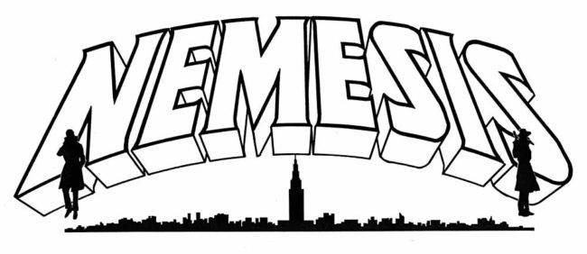
Again, a nice telescoping effect, and the serifs add a certain elegance to the lettering. I also like the gentle curve of the whole thing. What really puts it over the top, though, is the cityscape and the two trenchcoated figures underneath. Those really give it a mysterious espionage feel, which was perfect for the Nemesis backup feature. Letterer & logo designer Todd Klein tells me that these figures were not his work, as they were added by the series artist (presumably Dan Spiegle).
Blatant Self-Promotion Department: I wrote a history of Nemesis as my very first article for BACK ISSUE magazine. I drew up and colored a mock Nemesis cover to go along with the article, and Todd Klein was nice enough to send me a high-res scan of his logo for me to use on the cover. So now whenever I see this logo, I’m reminded of the generosity that Todd showed to a stranger on the internet. Thanks again, Todd!
Wolverine by Tom Orzechowski, 1982

This logo was done for Wolverine’s first mini-series in 1982, and it was designed by X-Men letter Tom Orzechowski, who deserves a Purple Heart just for fitting all that Chris Claremont purple prose into a reasonable number of word balloons for so many years.
I really like how the thick outlines play against the thinly-outlined drop shadow (A great trick for making the logo pop on the covers), as well as how the straight, sharp edges play against the occasional curve and the subtle serifs. And isn’t it cool how the points on the W, V, and the N all break the edge a bit? Perfect for our favorite berserker-raging mutant. Orzechowski is definitely the best he is at what he does.
The Mighty Thor by Alex Jay, 1983

This logo was introduced right after Walter Simonson took over the Thor book (with the old logo being memorably smashed on the cover of #337, Simonson’s first issue).

Simonson and logo designer Alex Jay decided to do something with Celtic letter forms, and I think it works just beautifully. It certainly has a lot more personality and individuality than the Thor logo we had through the 60s and 70s, and it lasted for quite a while after Simonson left the book. And again, we see another great use of thick outlines on the inside with thinner outlines around the exterior — always great for coloring around the border.
Alex Jay has done a great 8-part series on the creation of this logo over at his blog. You can read all eight parts here.
Crossfire by Mark Evanier, 1984

Crossfire writer and co-creator Mark Evanier confirmed to me that this logo is his work (as well as the one that replaced it when the book shifted to black & white). You don’t normally think of Evanier as a letterer or an inker, but he’s been in comics for so long that he’s a bit of a jack of all trades. It’s not uncommon for him to do art or lettering corrections on the books he edits.
Again, we see how a slight tilt can really add a lot of interest and personality to a logo. The thick outlines really help with the readability, too. The large circle representing the “O” was typically filled with some art element relating to the story inside, usually a headshot of Crossfire himself by series artist Dan Spiegle. In this issue, #12, the circle was filled with broken glass, representing the death of Marilyn Monroe in this classic cover by Dave Stevens:

The Punisher by Kevin Nowlan, 1985

This one was created by artist Kevin Nowlan for the Punisher’s first mini-series. Again, there’s a nice variety to the whole thing, so your eye never gets bored. I like how the enlarged “P” and “R” balance each other out and frame the whole logo. And at the same time, their shapes subtly evoke the Punisher’s skull emblem. You can’t see this one without immediately picturing the character.
Kevin Nowlan has shared some of his process and memories of creating this logo over on his blog. You can check it out here.
X-Factor by Kenny Lopez, 1985

This logo, as far as I know, was only used twice, on the first two issues of X-Factor, a new X-book that reunited the original five X-Men, including the until-then dead Jean Grey. I love that huge “X” silhouetted by the circle, which evokes the belt buckles on the X-Men’s old black and yellow costumes. And I love how it’s the width of the entire cover. But Marvel, at this time, typically put small figures or head shots into the cover corner box, so issue #3 introduced a skinnier version to free up that space. And just like the New Teen Titans logo above, I thought the change made it look a lot wimpier. The bold, thick letters we see here convey a strength that the skinny logo just doesn’t have, so it’s no wonder that the book got an entirely new logo before its first year was even out.
Robin by Kez Wilson (Robin emblem), with input by Curtis King & final render by Todd Klein, 1990

This is another logo that just grabs you right away. As Stan Lee would say, it’s zingy. I like how it builds off the Robin “R” emblem and continues the lettering in that style. This logo was used for all the mini-series featuring the Tim Drake version of Robin, as well as his long-running solo series that followed. Like the Daredevil logo above, it has an energy that fits the acrobatic character it represents. And I also like the contrast that the black drop shadow provides.
Well, those are some of my favorites. I’d list more, but I think I’ll save them to return to this topic another time. What do you think of my choices? Agree? Disagree? Are there any cool logos you think I missed? Let me know!
See you next week, True Believers!
I always liked that Detective one you have in the picture of jumbled comics at the top. I also liked the more “modern” Detective logo when Breyfogle was drawing it. I do not, however, like that Batman logo you showed. It’s just dullsville, man! The others are pretty cool, however. I don’t love logos cluttering up the cover art, but a good logo does catch your eye!
Yeah, I like that Detective logo, too. My favorite version of it is from when Mike W. Barr and Alan Davis were on the book in 1987 or so. I’ll probably feature that one the next time I do this.
…And the Gaspar Batman logo is “dullsville”? I’m not sure if we can be friends after this, Mr. Burgas. 😉
John: Oh dear …
Saladino is a wonderful letterer, but that logo just looks too utilitarian. I like the Batman backdrop, but the letters don’t do anything for me. I like the more dynamic one that came right after it (I think), but not that one. It’s just how I feeeeeel, man!!!! 🙂
I like the original Alpha Flight logo, but I don’t know if I like it so much as what’s inside the book. (I don’t like the second one that replaced it towards the end of Byrne’s run for no adequately explored reason).
I really like that you’ve covered a few periods here, not sticking to, say, the bronze age. Like I would’ve done. Your analysis brings up things I would never even have noticed, the dynamics of each and even some of the letter-forms (even though I’ve redrawn a couple of these logos, to stick onto my dividers).
Yeah, I also like the original Alpha Flight logo. I know that John Byrne has said that he modeled the second one after the ROM logo. He always liked that one because you could spot it from a mile away.
I always wondered why he changed it. ‘Spotting it from a distance’ makes sense.
Wow, one indy comic. I’ll add a few more with great logos. Howard Chaykin’s American Flagg; terrific patriotic eagle/shield. Mike Grell’s Jon Sable, Freelance, with the sable antelope points on the b and the l. MIke Barr and Adam Hughe’s Maze Agency, with its maze effect, inside the lettering. The Hernandez brothers’ Love & Rockets, with the nice juxtaposition of lettering styles in “Love” and “Rockets.” Jeff Smith’s Bone; slightly quirky, yet simple and elegant. Tim Truman’s Scout, with its bullseye O. The later Nexus logo, with the N that looked like an energy bolt. Scott McLoud’s Zot, simple, yet attention-grabbing. Mike Alred’s Madman; just as offbeat is its star. Paul Chadwick’s Concrete, with its classic lettering.; as gentle as the character. Dean Motter’s Electropolis, with its electric logo. Star Reach, the ground breaking “street level” anthology. Heavy Metal, with the logo collapsing under its own weight. The Spirit, a true classic.
I love a great many indy comics and their logos, but I had to draw the line somewhere to keep this column at a reasonable length (The Kitchen Sink Spirit logo JUST missed this time out).
But don’t worry, I’ll return to this topic in the future, and I’m sure some more indy comics will show up. But for the first one, yeah, I mostly stuck with the classics.
I really like everything they’ve done on Astro City.
Todd Klein has a great series of posts and analysis on logos on his blog. (http://kleinletters.com/Blog/logo-links/)
Fun to get lost in.
Some of my favorites over the years have been “Shade the Changing Man”, Batman in the early eighties, Cerebus, and Elfquest. More recently, love the Wicked and Divine logo.
Todd Klein has a great series of posts and analysis on logos on his blog. (http://kleinletters.com/Blog/logo-links/)
Fun to get lost in.
You mean the ones I linked to in the column, Doug? 😉
Legion of Super-Heroes has had some good logos. https://www.google.com/search?q=legion+of+super-heroes+logos&safe=off&tbm=isch&tbo
I didn’t like the 5 Year Gap logo but the others have their charm.