
Let’s take a look at a comic that was a throwback even when it was published, and is even more so now!


World’s Finest by Dave Gibbons (writer), Steve Rude (penciler), Karl Kesel (inker), Steve Oliff (colorist), and Bill Oakley (letterer).
Published by DC, 3 issues (Books One-Three), cover dated 1990 (they were released in June, July, and August).
(Below are the back covers of the issues, which I find fun.)


I mean, I don’t think I SPOIL anything, but you should always be aware when you read these posts that I could at any moment! And remember to click on the images to bigify them!
There’s a one-page flashback showing a boy kneeling in front of his parents’ graves and a stern-looking man standing behind him, offering comfort as he leads him away. It’s sepia-tinged, like all good flashbacks, and appears colored directly from pencils, to give it a gauzy, faded, nostalgic look. The page is important, obviously, but it’s also there so pages 2 and 3, where the story takes off, can be a double-page spread, and when we turn the page, we blast into the present with a stunning cityscape of Gotham City at dusk, the orange sun shining almost painfully on the Gothic and Art Deco architecture, throwing the spires into deep shadow yet illuminating some of the more disturbing avian imagery and highlighting the clockwork nature of DC’s most anti-human city.  In the foreground, crows seem almost surprised by the sun, recoiling in mid-air against its dying rays, and cranes and wrecking balls in the middle distance foreground one of the themes of the book, which is a sinister kind of urban renewal. On some of the smaller buildings, we can see tiled roofs, and domes and stained-glass windows complete the archaic feel of the city, while the towers and gargoyles give it a prickliness that reflects its most famous citizen. A few pages later, we get a mirror image of Gotham with Metropolis bathed in the rising sun. Doves, not crows, fly toward the glowing orb, both rising triumphantly over a shiny city, full of sleek buildings topped with futuristic domes, reflecting the sun in hundreds of floor-to-ceiling windows. Instead of clockwork and spires we get the globe of the Daily Planet and a sleek tower topped with a solar system model, and instead of a dark bird of prey gargoyle in the foreground we get an angel reaching to the sky, golden and blazing in the light, an arch with the city’s name proudly emblazoned on it stretching across the page. Greenery, not cranes, adorns rooftops, and people eat breakfast and dive into pools instead of fleeing from wrecking balls. These two images form the foundation of World’s Finest, a three-issue “Prestige Format” mini-series that DC published during the era of “Bat-mania,” despite its writer and artist refusing to give in to the general “darkening” of the Dark Knight that was so common at the time. Dave Gibbons and Steve Rude gave us a dark Batman, sure, but not a nihilistic one, and that helps make this a much more interesting book than a lot of Batman stuff that has come out from the publisher since Frank Miller went all-in on Psycho Batman.


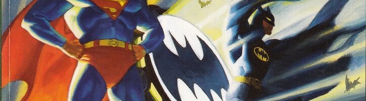
World’s Finest is Rude in peak form, as he had grown steadily as an artist from his early (still very good) years on Nexus, and he was freed from interpreting whatever came out of the bag of cats and monkeys that was Mike Baron’s brain and could just draw a coherent story.  Without having to worry about making the script intelligible, Rude could focus on the storytelling, and he’s brilliant at it. He’s inked by Karl Kesel, one of the best inkers comics has ever had, and Steve Oliff completes the trifecta of top talent working on the art. The two splash pages seen above are part of a tour-de-force opening, 16 pages with only two words of dialogue and two narrative tags, one indicating Gotham City and the other Metropolis. Rude doesn’t need words, and Gibbons wisely doesn’t give him any, as Rude contrasts Batman and Superman perfectly, shows how similar their lives can be, shows how vexing their main villains are, and introduces the third villain of the book. Batman takes down two muggers, one of whom commits suicide by chewing on a poisoned card, letting our hero know the Joker is about. Superman takes out a drug dealer who gets bailed out by Lex Luthor’s lawyer. Rude gives us a contrast in everything: Batman is taking down his dudes at twilight, Superman in the bright morning; Batman and the bad guys are shadowy figures, and Rude uses the silhouettes superbly, while Superman almost repels shadows;
  both instill fear, but Batman does it with theater while Superman does it simply by being better than anyone else; Rude draws Batman violently taking down the bad guys while he draws Superman’s violence just off panel, showing the results of it rather than the instance of it, so we get the sense that Batman is human while Superman stands above humanity. Oliff uses burnt hues to show Gotham at twilight, bringing in oranges and blues to complement the massive chunks of shadow, and then he gives us bright reds, blues, and yellows in Metropolis, all forming a majestic vision of the City of Tomorrow. In the three pages of flashback that introduce the third villain, it appears – as I noted above -that Oliff colors the pages directly from Rude’s pencils, while Rude gets rid of holding lines and Oliff uses sepia tones to not only take us into the past, but to contrast those pages with the crisp “present-day” pages that surround them. These are three artists who don’t need any words whatsoever, yet we get three rich scenes to begin this story.
Rude doesn’t just shine in the action scenes, of course. After the opening, we get to the crux of the plot, as Clark Kent and Bruce Wayne meet each other at the Midway Orphanage, which is on the train line halfway between Metropolis and Gotham.  Rude contrasts the two “civilian” identities of our heroes well, too, as Bruce is dressed in a black tuxedo, while Clark is in a white one, and Bruce is sleeker than Clark, who’s bulkier (even hidden in a tux) than Bruce. Bruce looks like a shark, while Clark looks like a prom king or an orchestra conductor. Bruce wears a thin, stylish tie and designer shirt, while Clark wears a nerdy bow tie and a vest. Even in their movements, Rude distinguishes them – at one point, a “presentation” is given, and Clark looks up through his glasses, his jaw set and his eyes upraised, while behind him Bruce also looks up, but his eyes remain hooded. It’s small touches like this that show Rude is paying attention even in quieter moments like this and works to set the two men apart. When, a few pages later, he introduces Lex and the Joker, it’s again a study in contrasts. Lex is bulky and powerful, not in a Clark Kent way, but in a gangster way, as someone who indulges their excessive whims but still works to stay in shape. Lex forces his way onto the page, displacing space by his presence, while the Joker – rail-thin and gangly – slithers over the page, always in angular motion, roaming about the edges of the panels (grabbing hold of the border in one of them) as if he can’t occupy the same space as Lex.
  Throughout the series, Rude does a marvelous job suggesting the chaotic nature of the Joker, as he never seems to be on center stage, but he’s always around, causing the world to become a bit crazier. Rude’s interpretation of the Joker is informed, it seems, by Alan Davis’s – the Joker’s legs are almost a bit too long, and he’s almost like a puppet, jerking oddly across the stage, until he suddenly goes for your throat. It’s a terrific way to draw the Joker, and Rude does it very well.
So much in this comic is gorgeous. Rude does a two-page vignette showing both Superman’s and Batman’s “secret origins,” with the left side of the page showing Krypton blowing up and Li’l Baby Clark getting found by the Kents, while the right side shows Li’l Brucie’s parents getting gunned down. Visually, Rude links the two – the panels mirror each other, as the panel showing Kal-El’s rocket flying away from the exploding planet is mirrored by the gun pointing at Bruce’s parents. But the differences between their origins comes out in the last panel, when they both wake from nightmares. Clark is lying beneath a (probably) hand-woven checked blanket, while Bruce has silk sheets. Clark has cornpone pajamas, Bruce is shirtless (and probably naked, because of course Bruce Wayne would sleep naked). Clark reaches for an illuminating lamp to chase away the nightmares, Bruce covers his head with the pillow and remains in the dark.  Oliff colors Clark’s “origin” in warm oranges, while Bruce is in cool blue. Neither origin shows any horrific violence, but the violence of these characters’ pasts is evident.
When Clark heads to Gotham and Bruce to Metropolis to deal with Luthor and the Joker, respectively (the villains have “switched cities” for the time being), Rude also does excellent work contrasting them. Clark is met by Alfred, who drives him to his hotel, and Rude shows us how seedy Gotham in just a few small details. While Clark is loading his luggage into the limousine, a pick-up truck drives by, in the back of which two boys are fighting. Nothing like that would happen in Metropolis, no sir! Behind Clark and Alfred on the wall are advertisements for strip clubs and violent action movies. As they pull away from the train station, a person covered in newspapers lies on the street underneath a ragged poster asking for charitable donations while the parking attendant checks out the centerfold of a sleazy magazine. No words needed, because Rude does such a nice job with the ancillary details. Bruce arrives in Metropolis at the astonishingly gorgeous train station, using a porter for his luggage (Clark, of course, does not use one) and brushing off Lois and especially Jimmy Olsen. The streets of Metropolis are, naturally, extremely clean, and there are no homeless people in sight. Later, when Clark tries to find out what Luthor is doing in Gotham, he hangs out at a run-down diner (called “World’s Finest Heroes,” which is a nice touch) with the people from the neighborhood, who are older and run-down themselves. Another homeless person has his head in a trash can outside.  Bruce, meanwhile, eats at his hotel, the Plaza, in its sumptuous restaurant, and tries to charm Lois (only succeeding when he takes Luthor down a peg, which earns her respect). In the interim between Christmas and New Year’s, Rude shows how different the two men are. Both of them are brooding about what Luthor and the Joker are up to, but Bruce does so in his cave, with only Alfred as company (Alfred is vacuuming, because of course he is), while Clark is among friends and family – even Jim and Barbara Gordon are there – and wearing a sweater he received as a present. On New Year’s Eve, he’s in Metropolis’s version of Times Square, while Bruce is staring out the window of the mansion. Rude is so good at laying out pages that all of these small things flow well with the narrative, and while he’s making visual points about the characters, he’s not interrupting the story to do it.
I’ve been writing about the way Rude draws, because he’s so good at that, but another thing that makes him such a great artist is the way he tells the story.  As I noted above, in the first two vignettes, we get a Batman almost always drenched in black, throwing his shadow over one bad guy who’s taken a hostage to let him know that that’s not acceptable, and then his shadow is cast over the dude’s face as he scrambles away, letting him (and us) know that there’s no escaping the Batman. I wrote about the punk in Metropolis and how we don’t see Superman’s powers in action, just the results. Rude does this throughout the book, making it such a fun reading experience because each panel can be lingered over for such a long time. When Superman stops the Joker’s bomb threat in issue #1, it’s a masterpiece of kinetic storytelling. There’s a chaotic street scene, with amazing details by Rude, showing clowns in a giant car rolling over the stopped traffic, coming toward the reader and driving the frightened motorists in front of them, so it almost become three-dimensional. Superman arrives, and a police officer points toward the chaos in the final panel on the page, leading Superman (and us) onto the next page. As Superman flies off to stop the bad guys, the cop slips on the oil the bad guys sprayed on the street, another nice detail by Rude. His swoop away leads us to the second panel, and Rude places the scene of the crime in the upper center of the panel, with Superman approaching from the bottom right, which leads our eye that way and on to the next panel row. In a swift series of panels, Superman opens a fire hydrant and flies off, allowing the water to spray into the air, counteracting the oil and the laughing gas. Rude shows Superman flying away to the bottom right, the same direction from which he entered, and we get a sense of speed, as the entire exchange took only seconds.
  Rude uses the same “camera angle” for the panel of Superman flying in and the one of him flying out, so we see all the people who were affected by the gas and the oil getting drenched by the water. In the final panel on the page, Superman flies from left to right – again, the way we would read the panel, so he leads us to the next page – while the cops get the situation under control. Rude adds various people smiling and dancing because they’ve been gassed, a nice detail on the panel. On the next page, Superman grabs a bomb the bad guys ignited and flies into the sky, forming a shield around it as it explodes harmlessly. Down in Metropolis, Rude shows how the people perceive the explosion, almost as a firework, and hilariously, the people he shows looking up are in the park, half-naked, interrupted during sex. Why did Rude do that? Who knows, but it’s a funny detail. Rude’s smooth style, combined with Kesel’s razor-sharp inks, make the action work like a dance, flowing and crisp, and this is just one example in the book.

So many little things make this book a joy to look at. Luthor’s lawyer, who gets the thug on the first few pages out of jail (see above, with the detail directly below), is so smug about it, and Rude makes her look that way with just a few short lines.  Lois has a “business” hair style when she’s at work and a sexier, sleeker look when she’s out socially. When a LexCorp machine “malfunctions” and begins destroying a Gotham apartment building, Rude has some fun with the inhabitants. One man goes out the window while sitting in an easy chair, while a trio of people come out a different window looking like they’d had a sex game interrupted, as the two men are dressed like Cupid. Lex’s log holder in his fireplace has a devil on the border prong, because of course it does. When he’s about to get busy with a young woman, we never see her face, as Lex only cares about her … other assets, so that’s what Rude shows us. At one point, for no good reason except he wanted to do it, he draws a young woman bending over to pick up paper off the floor, and a Daily Planet worker walks by and makes sure to check out her ass. When Superman gives Batman a video of Zorro for Christmas, Rude draws one crinkly eyebrow onto Batman’s mask, which is all the emotion he shows.
  Bruce has an old-school set of scales in his house, with one side deliberately weighted down, implying either that justice is unbalanced or that Batman can help redress the imbalance. At a theater in Metropolis, “The Two Noble Kinsmen” is playing, and while the play itself makes the title a bit ironic, showing it out of context in a book about Superman and Batman can’t be unintentional. A Luthor movie theater is playing Citizen Kane, another sly comment, although, again, it seems that Luthor would not want that being shown at one of his theaters. The Joker is apparently a big Ovaltine fan, which is a strange but fun detail. And two important characters are modeled on Laurel and Hardy, but Rude doesn’t turn them into cartoonish homages, simply draws them like humans who happen to look familiar and lets them go. It’s another odd detail, but then Rude has always been an idiosyncratic artist. All of this – the details, the storytelling, the design, and of course Rude’s smooth pencil work, Kesel’s crisp inks, and Oliff’s vibrant colors, make World’s Finest a visual treat.
Gibbons does nice work with the story, even though the actual plot is nothing revolutionary. As an artist himself, he knows the value of letting the art speak for itself, and he often – as I note above – gets out of the way so Rude can do his thing.  The nefarious schemes of the Joker and Luthor and the other villain in the book don’t need to be delved into here, because they’re typical nefarious super-villain schemes – fun to read about, but nothing we haven’t seen. Gibbons does a lot of stuff on the margins that makes the book far more than just a superhero romp. I mentioned above how Rude shows the two stars dreaming about the trauma in their childhoods, and Gibbons does a good job working almost entirely with an “orphan” theme without beating us over the head about it. In the two-page dream sequence, we’re reminded that Bruce and Kal-El are both orphans, and we’re also reminded that Luthor is an orphan, too, albeit a purposeful orphan, as the Joker implies he killed his own parents (I assume Luthor killing his own parents was canon at the time, but I’m not sure), and the Joker himself feels like an orphan, as well, doesn’t he? Of course, the Midway Orphanage is the focal point of much of the plot, and Gibbons never makes it explicit why Clark and Bruce are so interested in the welfare of the children – of course they would be! The plot involves Luthor and the Joker “switching” cities – Luthor decides to expand his business interests into Gotham, while the Joker wants to take a “holiday” in Metropolis and he needs Luthor’s permission. Batman and Superman “switch” cities as well, and Superman, naturally, is concerned about housing for low-income residents, while Batman wants to keep the Joker’s madness out of Metropolis. Gibbons does a good job showing the fundamental bedrock of each character without being obnoxious about it.
The way he depicts the characters is done well, too. Gibbons wrote this in the post-Dark Knight world, in which Frank Miller took both Batman and the Joker to their logical extremes, but it was before DC decided to make those personalities the default ones, so we could still get a different take on the two.  In this comic, Batman is dark, sure, but he’s not ridiculously grim. He cares very much about the orphans, for instance, and he’s perfectly willing to work with Superman without getting in a pissing contest with him first. He’s not warm and cuddly by any means, but he’s not the nihilistic asshole he has become over the years. The Joker, meanwhile, is still a chaotic force, but he’s not the psychopathic serial killer he is these days. He manages to make it through the entire comic without killing anyone! Luthor, in fact, is much more menacing – Gibbons portrays him as the businessman of the post-Crisis reboot, and his ambition and reach are far more terrifying than the Joker’s random acts of insanity. It’s tough but not impossible to thread the needle with the Joker, making him a threat without making him too psychopathic, but it can be done, and Gibbons does it well. Bruce and Clark show up a lot in the book, too, and Gibbons makes sure they’re distinct characters, even though they both fight for the same thing. When they first meet at the orphanage, Bruce says, “Evening, Kent,” and Clark returns with, “Uh, good morning, Mr. Wayne.” It must be after midnight, as it’s clearly nighttime, and Bruce responds with, “So it is. Ah, the precise mind of the trained journalist.” Clark says, “No big deal … Just looking on the bright side, I guess.” In just that brief exchange, Gibbons shows us Bruce’s cynicism and Clark’s optimism – Bruce being a creature of the night, Clark representing the hope of the day (they both know each other’s secret identities in this book), and neither being antagonistic about it, just a bit snarky in Bruce’s case. Later, when they agree to swap cities, Clark naturally suggests a team-up, but Bruce scoffs at the notion (in another nice Rude touch, Clark’s face is fully lit in this sequence, while Bruce’s is in shadows). Bruce isn’t angry about it, just dismissive (and Clark doesn’t think it’s a good idea, either, he just wanted to float it). It’s a nice touch, because Gibbons shows that they’re different people but not diametrically opposed to each other.
  Gibbons gives every character nice touches, too. Lois is whip-smart and is friendly with Alfred, which is neat. Jimmy Olsen is goofy, but it’s clear he knows what he’s doing. Alfred is a calming influence on Bruce, as he always is, and so is Gordon, to a degree. Perry White is stoic. Barbara Gordon embodies hope, which is a nice trait given the fact that she’s in a wheelchair. None of the ancillary characters are in the book all that much (Lois and Alfred more than the others, but even then, not too much), but Gibbons makes sure they make an impression. It’s fine work.
There’s a nice fancy hardcover collection of this series, which I’ve linked to below, but it appears to be out of print and it might be easier to find the individual issues. It’s one of those “modern” comics (yes, it’s over 30 years old) that feels like a good Silver Age book with modern sensibilities. Neither Batman nor Superman is a cynical jerk, and while both villains feel dangerous, neither is hideously deranged. Gibbons does an excellent job giving us heroes that care about each other and the people they’re protecting, even if one of them finds it a bit more difficult to express that. Rude’s gorgeous art, with Kesel’s sharp inking and Oliff’s dynamic colors, make the book look both modern and timeless. World’s Finest is not a comic that will shake the foundation of the characters’ worlds or of comics themselves, but it’s a superior example of two master storytellers at the top of their games. That’s pretty keen.
Hey, the archives are shaping up nicely, so take a look!

BURGAS: This version of WORLD’S FINEST remains my favorite.
Normally, I don’t like Superman, but the DUDE, man! Who can turn down the DUDE?!
Gibbons doesn’t do much writing, but this: is definitely one of his better works.
It’s a good book. And it’s out in paperback.
This gem asks for a Deluxe Edition, but what would I know?
The dude at his best imo.
World’s Finest was the first time I ever saw Steve Rude’s artwork and I’ve been a fan ever since. Pretty much snap up any book he works on.
Like you said, I think this book does the best job of getting and displaying the Superman/Batman dichotomy. A lot of other books have tried since then but haven’t come close.
This has to be one of the prettiest comics I’ve ever seen, the whole Art Deco style is excellent.
It doesn’t read as well as it looks unfortunately, I found the whole thing a bit dull and tedious.