[This post is from 15 June 2007, and sadly, both versions — the Wayback Machine one and the CBR one — have many images missing. Greg just loved the alt-text, which screwed up the Wayback Machine versions! Anyway, I try to figure out which images he used, so I hope I got them right. I apologize in advance if I miss any! Enjoy!]
Last week’s column [Edit: I haven’t reposted that yet, so I apologize!] reminded me of something I haven’t thought about in a long time; the war of wills in high school between me and my art teachers.
Art class had always been problematic for me anyway. I loved to draw, I had been drawing since I was old enough to hold a pencil, and I’d been getting paid for it since I was about thirteen (I was the go-to guy for bulletin board illos at the pre-school where Mom taught — I think there were three or four years there when every clown, snowman and choo-choo were Hatcher originals) and I really wanted to be an illustrator of some kind when I grew up. And the one class that should have been a refuge and a balm to my otherwise largely-unpleasant high school existence, was instead one of the biggest sources of frustration.
You’re probably way ahead of me at this point. You know the words, come on, sing along with my teachers: “But, Greg, are you going to do something more … serious?”
I’m certain many of you probably had the same conflict in high school, especially if you tried at some point to make the case to a teacher that comics WERE TOO Artistic and Important.
What my damn fool teachers never understood, with all their well-meaning pleas for me to abandon the junk and get ‘serious,’ was that I was deadly serious about comics and paperbacks and album covers and commercial art of all kinds. I didn’t give a damn about classical artists. My heroes were guys like Robert McGinnis, Jeff Jones, George Wilson, Fred Pfeiffer, Roger Dean. My dearest wish from the age of twelve on up through my mid-twenties was that someday I’d get to do paintings like this:

I don’t actually know who did the Bond covers for Bantam Books in the 1960’s and 70’s … nobody ever got credit in those days. I think it might have been Fred Pfeiffer from the look of it, but that’s just a guess. But oh, how I admired those cover paintings. That everything-but-the-kitchen-sink composition, coupled with the amazing lighting and figure work … yet always leading the eye where it needed to go, always working with the cover copy. I lusted to get as technically proficient as that.
What last week reminded me of, talking about Solomon Kane appearing in Marvel Premiere, was how I went charging out to get an actual Solomon Kane book. What I ended up with was this one.

Solomon Kane by Robert E. Howard, Centaur Press 1971. Cover by Jeff Jones. Now, the book was great fun, but the cover blew me away. Suddenly I saw how Kane’s Puritan garb could look tough and cool after all, with the right artist depicting him. And I spent the next few weeks in art class trying to figure out how Jones had got there and do it myself, which led to conflicts with my teacher (I still remember Mr. P’s plaintive comment: “Pilgrim swordfights? Can’t you do something a little more … serious? Why is it always about violence?”) and … well, the column’s not going to be about THAT.
What I did want to talk about was the group of cover illustrators that were my real teachers. These guys rarely got credited; many of them, I had no idea what their names were until just a couple of years ago, when the internet made it possible for those of us that love this stuff to pool resources and share information. Some of them worked in paperback illustration, some worked in comics, and many of them did both, along with whatever other work came in over the transom.
Anyway, here are a few of my favorites. You may not always know the names but I bet you know the work.
*
Probably the first painter whose work I learned to recognize was George Wilson.
[Edit: Greg put something here, but I have no idea what it was, and he doesn’t obliquely refer to it anywhere to provide clues!]
Wilson was EVERYWHERE when I was a kid. He painted the covers for most of Gold Key’s line of comics, along with what seemed like every other paperback cover on the racks.

My all-time favorite pieces from him are the cover paintings for the Avon paperback Phantom novels in the mid-70’s.

The Phantom books were the place where I finally figured out Wilson’s name, and that the G. Wilson signing the covers there was the same GW whose signature had been obscured on other covers I loved.
[Edit: Another image that did not transfer. Sorry!]
Don’t tell me the fellow who painted THAT didn’t have his finger on the pulse of the comics-reading public!
I wish I could tell you more about George Wilson. I only knew his work — a wonderful, seemingly endless parade of heroic guys, buxom girls, monsters, and gangsters, all embroiled in situations of life and death. At least he’s getting a little recognition these days. Auction houses are carrying page originals like the one shown above and getting some serious money for them. I have been searching the internet for the last week hoping to turn up some biographical information about him, but all I could dig up was that he’d been interviewed in the Gold Key retrospective issue of Comic Book Artist — #22 — and though I searched high and low throughout seven different comics shops here in Seattle the last couple of days, no one has that issue. None of the indexes I have here in the house have any mention of him either, which seems like a criminal omission to me. (Certainly Ron Goulart should know better, at least!) I did find this photo of him. That and the heads-up on CBA #22 are the best I can do for you.
[Edit: Sorry, again, there’s no image and no context clues!]
Nevertheless, figuring out the name “George Wilson” was a great revelation to me, in my youth. Suddenly I started to pay real attention to things like signatures on the the cover art of the novels I was reading. And that was when it dawned on me that a great many of my favorite comics artists also happened to be my favorite paperback artists too: for example, this particular piece from Gray Morrow isn’t really all that great, but it tickled me no end that it was by Gray Morrow. I KNEW that name! He was a comics guy!

In fact, most of the time I preferred the comics guys’ paperback cover work. Certainly for me Jim Steranko’s book covers are miles beyond his comics.
[Edit: Google “Steranko shadow cover” and you’ll see some, one of which I assume was here!]
I especially loved his Shadow covers. He did two sets of them — the first dozen or so for the Pyramid books reprints were very much in the spirit of the Rozen originals …
[Edit: Ibid.]
And then the publisher wanted something more retro and pulpy. The irony is that Steranko’s first swing at it was much closer to the original Shadow pulps.
[Edit: Ibid.]
Steranko even got in on the sword-and-sorcery barbarian craze of the 70’s.

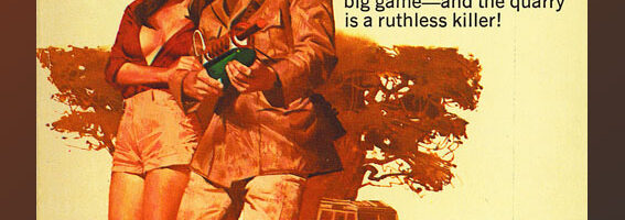
Interestingly — though some might disagree — my feeling has always been that the whole Robert E. Howard revival and sword-and-sorcery craze in 70’s paperback fiction was a direct result of another illustrator’s work; one of comic books’ most famous alumni.

Frank Frazetta was absolutely the guy to beat, when it came to 70’s fantasy book covers. He owned that genre. If the hero of the story wore a loincloth, the cover was either by Frazetta himself or a guy trying to swipe Frazetta’s signature riffs.
[Edit: This is a Richard Corben “swipe,” but I don’t know which one!]
It was Frazetta’s Conan covers for Lancer that made that series a hot seller, it was the Lancer paperback success that allowed Roy Thomas to persuade Stan Lee to let Marvel try the Conan comic … and we all know where it went from there.

(Yes, it’s very unfair and rude of me to suggest Boris Vallejo was a Frazetta clone; he has a huge body of work of his own. Nevertheless, back then it did always seem like Boris was the guy you got for your barbarian when Frazetta couldn’t do it.)
Frazetta didn’t JUST do barbarian fantasies, though. He did lots of other covers as well. I am a big fan of Dorothy Gilman’s Mrs. Pollifax novels, as it happens, but I sure wouldn’t have picked Frank Frazetta to do the cover for one. Yet here it is.

Likewise this one is so wonderfully odd I had to post it. Frazetta doing Oz? Who knew?

Certainly I admired Frank Frazetta — and I tried my hand at a couple of barbarian paintings in class — but really, I was way outclassed there and I knew it.
On the other hand, Earl Norem’s work was simple enough that I could sort of deconstruct it.
[Edit: Nope, no idea what Greg had here.]
Norem was one of the great unsung illustrators. He never will make anyone’s top ten list of anything, but I sure own a lot of his work and the more I look at it the better I like it. He had a great eye for making an insane situation look very plausible. And every once in a while his work verged on the poetic.
[Edit: Again, nothing, but Google remains your friend!]
I was always a sucker for the portrait-overlaying-action composition. (Like the Bond cover, earlier.) Norem didn’t do it often — he was more of a meat-and-potatoes traditional illustrator, a pick-a-scene-and-do-it guy — but when he did occasionally go a little abstract, it was a treat. He did a lot of work for Marvel, in both the magazine line and also the licensed projects like storybook illustrations and so on for young-adult tie-in novels published through Scholastic. Last I heard he was retired, living in New England, doing the occasional mural for a military museum up there.
The only guy that seemed to be putting a dent in the Frazetta/Boris domination of the fantasy book cover market was Jeff Jones, whose work I studied really fiercely.
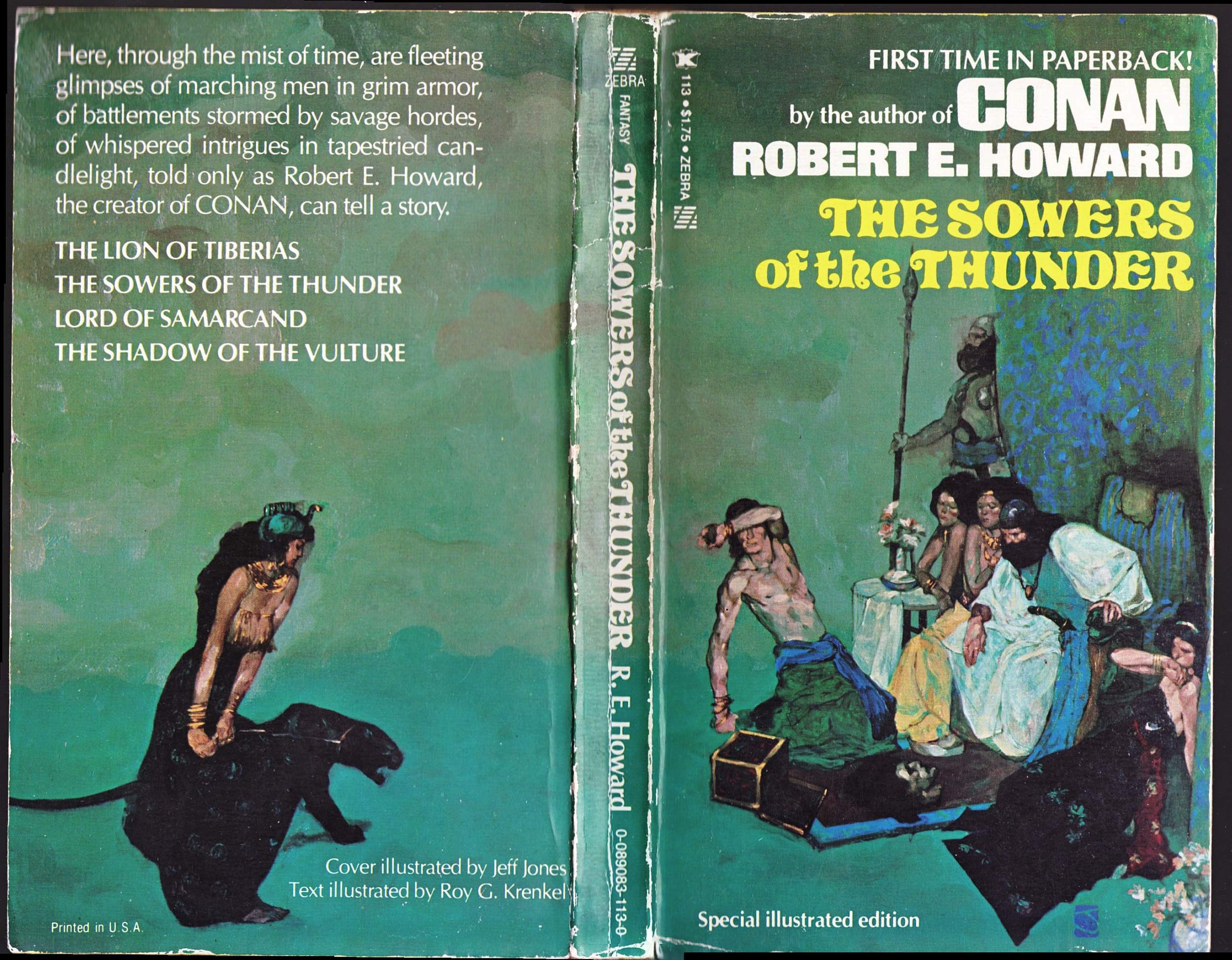
It was so loose, and yet it seemed so … designed.

I was awed at a guy who could paint things that were so splashy-looking and yet always came out right.
[Edit: Yeah, I don’t know if Greg put another Conan cover here … I suspect he didn’t, so I’ll skip it.]
I think Jones might have been on the edges of comics here and there — but I only knew his paintings. They always blew me away.
Of the comics crowd that were doing paperbacks, my absolute favorite was Howard Chaykin. I loved his design sense (so did a lot of other fans, apparently; he never gets credit for it, but I think you can make a case that it’s Chaykin’s page layout aesthetic that rules modern comic books today.).
[Edit: No idea what was here. Sorry!]
What I liked about Chaykin’s book covers was that they brought the same energy he put into his comics. Check out this pair of wraparound designs.
[Edit: We can’t, Greg, because you loved the alt-text too much!]
Got these from another original-art auction site — no idea what books they’re from. But I’m kind of glad I found them like this — it would be almost criminal to clutter up those back covers with text.
[Edit: Another one lost forever … ever … ever …]
Another Marvel guy I really admired that bounced from comics to paperbacks and back again was Bob Larkin.

Larkin I first learned to recognize as the guy who did the covers on all those Marvel Fireside paperback collections. I liked his covers; they had a wonderfully simple, movie-poster look to them.
[Edit: Yep, no idea what was here.]
I’d see his signature on other stuff here and there and it always made me smile. You have to wonder if he got a drunk Charles Bronson to pose for this one.
[Edit: I’d love to see what Greg thought a “drunk Charles Bronson” looked like, but I can’t find this!]
He could do those floating-portrait action collage compositions I love so much, too. Check it out:

Larkin’s great gift was the ability to light things in a really weird way and still make it work.
[Edit: If only we could see what Greg was talking about!]
You know, I’m damned if I can figure out where exactly the light’s coming from there. Torches? A fire? Moonlight? But I had to stop and really look to realize that … at a casual glance it’s completely plausible. Larkin also painted the corner-box portrait of Conan on that cover and I think it’s one of my favorite illos of the big guy anyone ever did; it looks like a photo of the guy John Buscema was drawing.
Best of all, Bob Larkin has a fan’s quirky humor. You had to be a certain age to get the joke here …

Don’t see it? Let me help you.

Now THAT’s nerdy. You have to be pretty seriously geeked out to think of an homage like that.
As it happens, the 1967 original Trek cover painting is by the great James Bama. Bama’s body of work is mostly Westerns — you can see a lot of his stuff gracing the Louis L’Amour Bantam paperbacks — but what I loved him for was his Doc Savage.
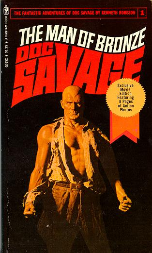
He did the first 62 of the Bantam books and it was a vision of Doc so popular and powerful that to this day, everyone but pulp-magazine purists think Doc Savage has a widow’s peak honed to a point sharp enough to be a weapon. Marvel and DC both used that visual for the comics version of Doc, and I believe Nostalgia Ventures is occasionally using the Bama covers on their pulp reprints of the Doc Savage stories as well.
James Bama never actually worked in comics, but he was in them. His Aurora Monster Model Kit box illustrations showed up on quite a few back cover ads.

James Bama’s no longer doing illustration work — he decided to concentrate on his fine art Western paintings in the 70’s — but he is still regarded as one of the greats. He was inducted into the illustrator’s Hall of Fame in 2000, and there are several books about the man and his work available, including last year’s James Bama: American Realist. Any or all of them would be well worth your time.
When James Bama left the Bantam Doc Savage series another favorite of mine stepped in — a fellow by the name of Fred Pfeiffer.

He did the only non-Bama Doc covers that I thought looked … well, right. Boris Vallejo did some good ones and so did Bob Larkin, but they felt like forgeries, somehow. Pfeiffer seemed to catch that same sense of weighty importance, of world-threatening danger, that Bama gave Doc.

Pfeiffer’s name is virtually unknown to anyone except the hardcore vintage paperback enthusiasts, and I didn’t even know his first name was ‘Fred’ until very recently — but I knew to look for that “Pfeiffer” signature. It wasn’t always there, but it was there often enough that I could get a sense of his style. I’m pretty sure the Colonel Sun at the top of the column is one of his.
And it will amuse my friend Rick and other frequenters of the CBR Community forum to know that Fred Pfeiffer did the cover of one of our favorite trashy paperbacks of all time, too.

Sadly, Fred Pfeiffer is no longer with us. He worked in and around magazine and book illustration throughout the 60’s and 70’s, never really getting rich or famous, and then he took his own life. I wish he had a chance to know how many people out there admired his work — certainly I did. Those Bond covers were probably a bigger influence on me, when I was first trying to teach myself to paint illustrations, than anything else.
My favorite paperback illustrator of all time never did comics. Although I bet he’d have been amazing … and considering what a gift he has for painting the female figure, he’d have been a huge success in today’s market.

Robert McGinnis could do it all — still can — but what he is most famous for are the lurid paperback covers he did for Fawcett Gold Medal throughout the fifties and sixties.
Most people remember his Good Girl Art stuff, for hard-boiled detective books like Carter Brown and Mike Shayne … and certainly he can bring the sexy. But what I love about Robert McGinnis is the design sense. His cover for the Travis McGee adventure The Dreadful Lemon Sky shows what he could do when he was really designing with the A-game.

Here’s another one I got off his web gallery —
[Edit: Nope. Sorry!]
Now, I have no idea what this is from, but just look at it. You can pretty much tell what kind of story it is, the mood of Hitchcockian suspense, danger and betrayal. It’s all there in the painting.
If you are not familiar with McGinnis through his paperback covers, you probably know his movie posters. That was where I first saw his work …

I think I was probably the only eleven-year-old in the Lake Theatre back then who was so interested in the posters in the lobby. I went over these like a coroner trying to find forensic evidence, searching for a signature.
[Edit: Dunno, but his Bond posters are pretty cool, and you’re probably already familiar with them!]
Anyway. Those were the guys I went back to, over and over, when I was teaching myself to paint and draw. There are lots of other fellows just as good that I didn’t mention. This isn’t anything like a comprehensive history; I hope, though, that if this column results in anything it sends a few of you in search of one. There are several books on the subject; I already talked about the Bama ones, and there’s a whole library of books about Frazetta and a new documentary DVD as well. And my man Robert McGinnis even got his due recently, with a couple of new books devoted to him.
As for me, I did eventually turn pro. I’ve worked in and around magazine and advertising art for some twenty years now … but my favorite gig, as most of you know, is teaching comics and cartooning to aspiring 6th and 7th grade illustrators all over the city. I became an art teacher that promotes comics and illustration in schools. And you know the best part? The schools came to ME and asked for this program.
So yeah, I eventually did something “serious.” About comics. In school. For money. Suck on THAT, Mr. P.
See you next week.
SATURDAY ADDENDUM:
We just came from having dinner with our old friends Kurt Mitchell and Rob Allen, and in talking about this week’s column Kurt asked me if it was true that Steranko had done the cover to The Avengers vs. the Earth-Wrecker, the first-ever Marvel novel, written by Otto Binder and published in 1967.
“One of his first jobs,” Kurt added. “That’s what I was told.”
My first thought was, No way, and I said as much to Kurt. “Anything’s possible … but I don’t think so. The lighting’s all wrong. Steranko didn’t paint that way, ever. You look at other work he did around the same time and even then … he just didn’t light things that way. I don’t actually know WHO did that one but I don’t think it was Steranko. Survey says no.”
It has continued to nag at me, though, and after we got home I pulled out the book and stared at it.

There is a hint of a signature, a thin horizontal scribble just to the right of Wanda’s knee, but it’s illegible. Not Steranko, I’m certain of that.
Just for the hell of it I Googled around, and — believe it or not — the only listed cover-art credit for the book says “Robert McGinnis.” However, that’s a dealer listing, not an actual index or reference. It’s not unheard-of for a dealer to mis-attribute such things, by accident or by design. McGinnis is a more plausible guess than Steranko, and it could be his signature down there, but if that’s true then it’s certainly not one of his best. Again, anything’s possible, and I don’t actually know. It looks more like a McGinnis imitator to me, the poses are a little too awkward.
My first thought when Kurt brought it up, based on those awkward action poses — Cap and Hawkeye’s, in particular — was that the cover artist on the Binder book was “the Matt Helm guy.”

I have no idea who this artist is … I just know that he did a lot of these weird, angular, impressionistic covers for Fawcett Gold Medal in the mid-60’s, including all of Donald Hamilton’s Matt Helm novels. So I pulled a couple of those out and stared at them for a while. The trouble is, they’re not painted.
So now I’m back to thinking maybe it WAS McGinnis. Wanda certainly has the look of a McGinnis girl. Which would mean that he DID do sort of comics/superhero work, at least once.
Yeah, I know. I have too much time on my hands. But it’s going to bother me for at least another day or two, and it would be nice to know. Who knows? Anybody? Bueller?
See you next week.
… so who DID paint the Avengers/Earth-Wrecker novel cover? Was it McGinnis?
I loved Jeff Jones’ cover art to Wonder Woman #’s 199 and 200, both of which had a painterly feel to them. GCD index says pencils & inks. Not sure.
The painter on the Avengers/Earth-Wrecker cover was definitely Robert McGinnis.
Joe Jusko wrote an article about it and other iconic McGinnis’s covers for the 13th Dimension blog.
https://13thdimension.com/13-magnificent-robert-mcginnis-book-covers-by-joe-jusko/
Thanks mate. I love Greg’s enthusiasm for these pulp book cover artists.
McGinnis seemed to have a thing for women’s feet, based on a lot of his pulpy crime covers. Love his Bond stuff.
There are some of Chaykin’s paperback cover illustrations in Dynamite’s The Art of Howard Chaykin; some really good stuff. I used to have the collected volume of Phillip Jose Farmer’s Greatheart Silver stories (which started in Byron Preiss’ Weird Heroes), with the Chaykin cover. His painted work has a lot in common with movie and magazine illustrator Robert Peak, who did posters for Camelot, My Fair Lady, Superman, and Rollerball. You can especially see it in how Chaykin copied his way of showing lighting glinting off metal.
Earl Norem did a lot of men’s adventure mags and also several Marvel magazine covers. He also did a couple of GI JOE storybook illustrations and a Fantastic Four.
On McGinnis, I’m glad Greg underscores the fact that he was not just a ‘good girl’ artist but also top-notch designer (something I mentioned in a comments on one of Fraser’s posts a few months back).
By the way, Greg (B): the two Chaykin wraparound covers that Greg mentioned may be the ones to Farmer’s Greatheart Silver (mentioned by Jeff above) and to Zelazny & Saberhagen’s Coils. Here are links to the former and the latter.
Otherwise, I liked that for Pfeiffer you posted the image from the cover of Leiber’s A Specter is Haunting Texas – that’s the edition I have, and I *love* that cover.
Thanks for those Chaykin links — I imagine Greg probably posted at least one of them!
The Leiber cover is actually one of the ones that survived, so it’s Greg’s original contribution. And you’re right — it’s very keen.